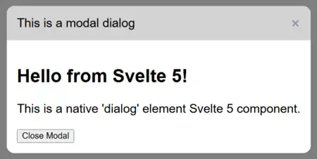
Dialog.svelte is a Svelte 5 modal component built on HTML's <dialog> element. It renders a modal dialog with a title, optional corner close button, light-dismiss support, and arbitrary child content.
Import
Import the component from the library source:
<script lang="ts">
    import Dialog from '#lib/Dialog.svelte';
</script>
Import from
$libfor SvelteKit 2.
The component expects the styles from src/new-main.css. In this project, import that stylesheet from the application entry point or layout so the dialog container, header, content area, backdrop, and close button are styled:
import '../new-main.css';
This CSS should be merged into your project.
Basic Usage
Control the dialog with a bindable isOpen state:
<script lang="ts">
    import Dialog from '$lib/NewDialog.svelte';

    let isDialogOpen = $state(false);
</script>

<button onclick={() => (isDialogOpen = true)}>Open dialog</button>

<Dialog bind:isOpen={isDialogOpen} title="Account details">
    <p>Your dialog content goes here.</p>
    <button onclick={() => (isDialogOpen = false)}>Close</button>
</Dialog>
A
closebutton should always be provided by the component consumer, or, perhaps after a client-slide process initiated by the dialog, close it by settingisDialogOpentofalse.
When isOpen changes to true, the component calls showModal(), makes the page body inert, and displays the dialog. When it changes to false, the component closes the dialog. Pressing Escape, clicking the corner close button, or light-dismiss clicking the backdrop also updates the bound state to false.
Props
| Prop | Type | Default | Description |
|---|---|---|---|
title |
string |
Required | Text displayed in the dialog header. |
isOpen |
boolean |
false |
Controls whether the dialog is open. Use bind:isOpen to keep parent state synchronized. |
marginTopPercent |
string |
undefined |
Sets the dialog's top margin in viewport-height units. For example, marginTopPercent="20" places it approximately 20vh from the top. |
disableLightDismiss |
boolean |
false |
Prevents clicking the backdrop from closing the dialog. |
disableCornerClose |
boolean |
false |
Hides the close button in the dialog header. |
| children | Snippet |
Required | Content rendered inside the dialog body. Pass content between the component tags. |
Dismissal Options
Light dismiss is enabled by default:
<Dialog bind:isOpen title="Dismissible dialog">
    <p>Click outside the dialog to close it.</p>
</Dialog>
Disable light dismiss when the user must perform an explicit action:
<NewDialog bind:isOpen={isDialogOpen} title="Confirm action" disableLightDismiss>
    <p>Choose an action before closing this dialog.</p>
    <button onclick={() => (isDialogOpen = false)}>Continue</button>
</NewDialog>
Hide the header close button with disableCornerClose:
<NewDialog bind:isOpen={isDialogOpen} title="Required step" disableCornerClose>
    <p>This dialog is closed by the action below.</p>
    <button onclick={() => (isDialogOpen = false)}>Complete</button>
</NewDialog>
The Escape key still closes the dialog through the native <dialog> close event. If that behavior should be prevented, the component currently needs to be extended to handle and cancel the native cancel event.
Positioning and Styling
Set the optional top offset as a numeric string:
<NewDialog bind:isOpen={isDialogOpen} title="Positioned dialog" marginTopPercent="15">
    <p>This dialog uses `margin-top: 15vh`.</p>
</NewDialog>
src/new-main.css also supports CSS custom properties on the dialog container, including:
--dialog-margin-top--dialog-header-bg--dialog-content-bg--dialog-backdrop-bg--dialog-backdrop-blur--dialog-header-color--dialog-header-font-size--dialog-padding-inline--dialog-padding-block
These variables can be set on an ancestor of Dialog or on the component's wrapper. The component uses the native modal backdrop, so the dialog is rendered above the rest of the page and the document body is made inert while it is open.
Notes
- Uses the Svelte 5
$stateand$bindableRune to track the dialog's open state. - Always provide a way to close the dialog when
disableCornerCloseis enabled.