An expand/collapse menu component
NavTree renders a JavaScript object into a HMTL using detail/summary tags to management the expansion. No JavaScript is required to expand/collapse the menu.
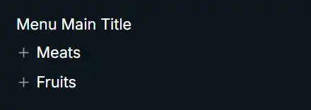
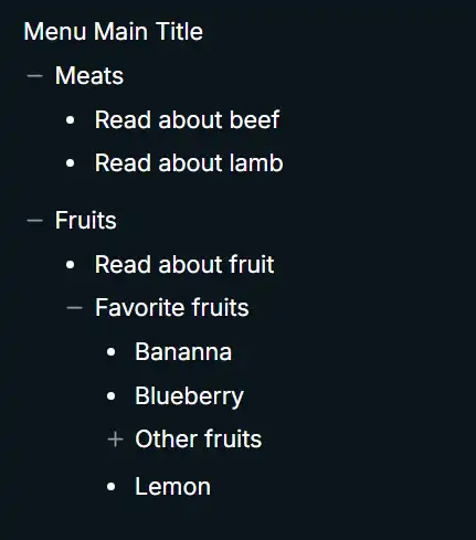
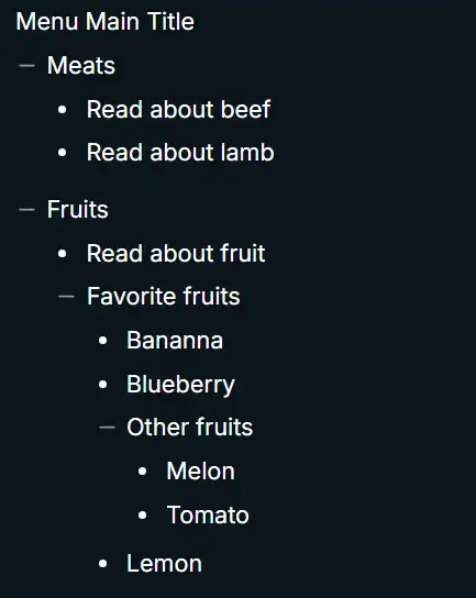
Using NavTree's basic CSS, the following images show its output.
NavTree with no expansion
NavTree with partial expansion
NavTree with partial expansion
Defining the menu structure
The menu shown in figure 1 is defined with this JavaScript object structure. Submenu items can be nested as deeply as needed, but generally three-deep is the rational limit.
export const exampleMenu = {
    title: 'Menu Main Title',
    menuItems: [
        {
            title: 'Meats',
            submenu: [
                {
                    title: 'Read about beef',
                    url: '/meats/beef'
                },
                {
                    title: 'Read about lamb',
                    url: '/meats/lamb'
                }
            ]
        },
        {
            title: 'Fruits',
            submenu: [
                {
                    title: 'Read about fruit',
                    url: '/general/fruit'
                },
                {
                    title: 'Favorite fruits',
                    submenu: [
                        {
                            title: 'Bananna',
                            url: '/fruit/bananna'
                        },
                        {
                            title: 'Blueberry',
                            url: '/fruit/blueberry'
                        },
                        {
                            title: 'Other fruits',
                            submenu: [
                                {
                                    title: 'Melon',
                                    url: '/general/Melon'
                                },
                                {
                                    title: 'Tomato',
                                    url: '/general/tomato'
                                }
                            ]
                        },
                        {
                            title: 'Lemon',
                            url: '/fruit/lemnon'
                        }
                    ]
                }
            ]
        }
    ]
};
Object menu types:
    export type TreeMenu = {
        title: string;
        menuItems: SubMenuItem[];
    };

    export type SubMenuItem = {
        title: string;
        url?: string | undefined;
        submenu?: SubMenuItem[] | undefined;
    };
Rendered HTML
<div>
  <div>Menu Main Title</div>
  <div>
    <details>
      <summary>Meats</summary>
      <ul>
        <li><a href="/meats/beef">Read about beef</a></li>
        <li><a href="/meats/lamb">Read about lamb</a></li>
      </ul>
    </details>
    <details open="">
      <summary>Fruits</summary>
      <ul>
        <li><a href="/general/fruit">Read about fruit</a></li>
        <details open="">
          <summary>Favorite fruits</summary>
          <ul>
            <li><a href="/fruit/bananna">Bananna</a></li>
            <li><a href="/fruit/blueberry">Blueberry</a></li>
            <details>
              <summary>Other fruits</summary>
              <ul>
                <li><a href="/general/Melon">Melon</a></li>
                <li><a href="/general/tomato">Tomato</a></li>
              </ul>
            </details>
            <li><a href="/fruit/lemnon">Lemon</a></li>
          </ul>
        </details>
      </ul>
    </details>
  </div>
</div>
The Svelte 5 component source
The MenuItem1 snippet recursively renders the menu structure.
<script lang="ts">
    export type TreeMenu = {
        title: string;
        menuItems: SubMenuItem[];
    };

    export type SubMenuItem = {
        title: string;
        url?: string | undefined;
        submenu?: SubMenuItem[] | undefined;
    };

    interface props {
        loadLink: (event: MouseEvent, url: string) => Promise<void>;
        menu: TreeMenu;
    }

    let { loadLink, menu }: props = $props();
</script>

{#snippet MenuItem(menuObj: SubMenuItem)}
    {#if menuObj.submenu}
        <details>
            <summary>{menuObj.title}</summary>
            <ul>
                {#each menuObj.submenu as item (item.title)}
                    {#if item.submenu}
                        {@render MenuItem(item)}
                    {:else}
                        <li class="deep-dive-article">
              <!-- if loadLink function provided, call it. -->
                            {#if loadLink}
                                <a href={item.url ?? '/'} onclick={(event) => loadLink(event, item.url ?? '/')}
                                    >{item.title}</a
                                >
                            {:else}
              <!-- Otherwise emit a standard anchor tag. -->
                                <a href={item.url ?? '/'}>{item.title}</a>
                            {/if}
                        </li>
                    {/if}
                {/each}
            </ul>
        </details>
    {:else}
        <!-- This a top-level menu object that has only title and url properties.  -->
        <a href={menuObj.url ?? '/'} onclick={(event) => loadLink(event, menuObj.url ?? '/')}
            >{menuObj.title}</a
        >
    {/if}
{/snippet}

<div class="tree-wrapper">
    <div>
        {menu.title}
    </div>

    <div class="menu-content">
        {#each menu.menuItems as item (item.title)}
            {@render MenuItem(item)}
        {/each}
    </div>
</div>
{% end raw %}
{% caption 'Figure 3. Svelte 5 NavTree component.' %}
Describe the optional loadLink function.
NavTree basic CSS
{% raw %}
@scope (div.tree-wrapper) {
    :scope {
        font-size: 0.9rem;
    }

    /* 1. Clear out default markers completely */
    details summary {
        list-style: none;
        margin-top: 0.3rem;
    }
    details summary::-webkit-details-marker,
    details summary::marker {
        display: none !important;
    }

    details > summary + * {
        margin-top: 0.2rem;
        margin-bottom: 0.2rem;
        margin-left: 1.2rem;
    }

    div.sidebar > details details {
        margin-left: 1rem;
    }

    div.sidebar > details details details {
        margin-left: 1rem;
    }

    div.sidebar > details:not(:first-child) {
        margin-top: 0.5rem;
    }

    /* 2. Setup the Flexbox container */
    summary {
        cursor: pointer;
        /*
           Use inline-flex for tight wrappper or
           flex for full width
        */
        display: inline-flex;
        align-items: center;
        gap: 5px; /* Gap between icon and text */
    }

    li.deep-dive-article {
        margin-left: 1rem;
        text-indent: -0.7rem;
        display: list-item;
        list-style: disc;
    }

    li {
        display: flex;
        align-items: center;
        gap: 5px;
    }

    li::before {
        content: '';
        display: inline-block;
        width: 14px;
        height: 14px;
        flex-shrink: 0;

        background-color: #9b9a96;

        -webkit-mask-image: url('data:image/svg+xml...);
        -webkit-mask-repeat: no-repeat;
        -webkit-mask-position: center;
        -webkit-mask-size: contain;

        mask-image: url('data:image/svg+xml...);
        mask-repeat: no-repeat;
        mask-position: center;
        mask-size: contain;
    }

    ul {
        padding-left: 5px;
    }

    ul > li:not(:first-child) {
        margin-top: 0.3rem;
    }

    ul > li:last-child {
        margin-bottom: 0.5rem;
    }

    details[open] > details {
        margin-bottom: 3rem;
    }

    summary {
        margin-top: 0;
    }

    /* 3. Render the SVG Icon */
    details > summary::before,
    details summary summary::before {
        content: '';
        display: inline-block;
        width: 14px;
        height: 14px;
        flex-shrink: 0;

        background-color: #9b9a96;

        /* Lucide plus sign icon.
       https://lucide.dev/icons/plus
     */

        -webkit-mask-image: url("data:image/svg+xml...);
        -webkit-mask-repeat: no-repeat;
        -webkit-mask-position: center;
        -webkit-mask-size: contain;

        mask-image: url("data:image/svg+xml...);
        mask-repeat: no-repeat;
        mask-position: center;
        mask-size: contain;
    }

    details[open] > summary::before {
        background-color: #9b9a96;

           /* Lucide minus sign icon.
          https://lucide.dev/icons/minus
      */

    -webkit-mask-image: url('data:image/svg+xml...);
        -webkit-mask-repeat: no-repeat;
        -webkit-mask-position: center;
        -webkit-mask-size: contain;

        mask-image: url('data:image/svg+xml...;
        mask-repeat: no-repeat;
        mask-position: center;
        mask-size: contain;
    }
}
{% end raw %}
{% caption 'Figure 4. NavTree's basic CSS (use it or brew your own' %}
NavTree usage
import { exampleMenu } from '#lib/data/persistent/example-menu.ts';

const menu = exampleMenu as TreeMenu;

...

<NavTree {menu}></NavTree>
{% caption 'Figure 5a. NavTree usage without the loadLink function.' %}
{% raw %}
async function loadLink(event: MouseEvent, url: string): Promise<void> {
    event.preventDefault();
    isLoading = true;
    errorMessage = '';

    try {
        contentHtml = await fetchContent(url, 'div.content-wrapper');
    } catch (error) {
        errorMessage = error instanceof Error ? error.message : 'Unable to load document';
    } finally {
        isLoading = false;
    }
}

...

<NavTree {loadLink} {menu}></NavTree>